
REBRANDING | PACKAGING | MARKETING
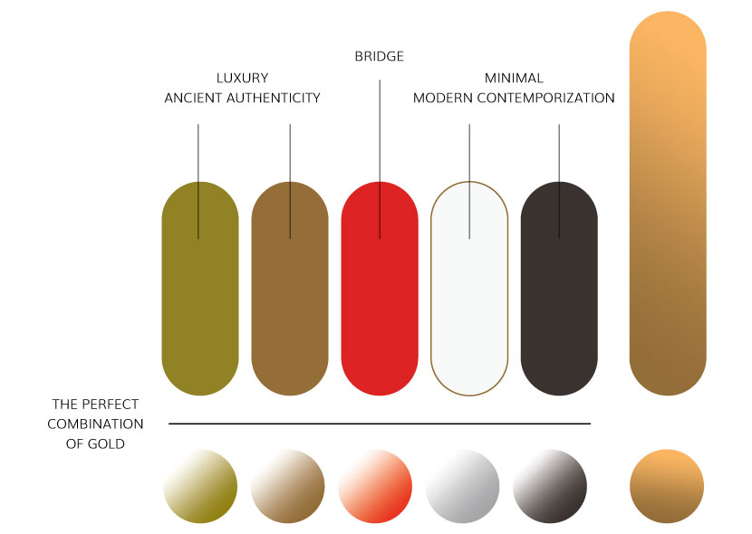
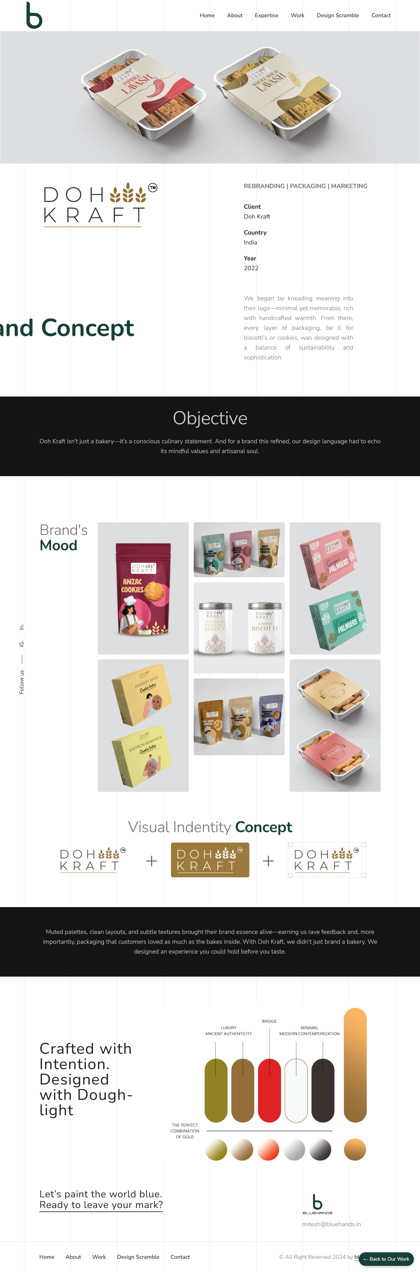
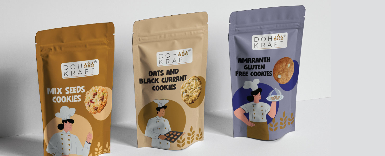
We began by kneading meaning into their logo—minimal yet memorable, rich with handcrafted warmth. From there, every layer of packaging, be it for biscotti's or cookies, was designed with a balance of sustainability and sophistication.
Doh Kraft isn’t just a bakery—it’s a conscious culinary statement. And for a brand this refined, our design language had to echo its mindful values and artisanal soul.
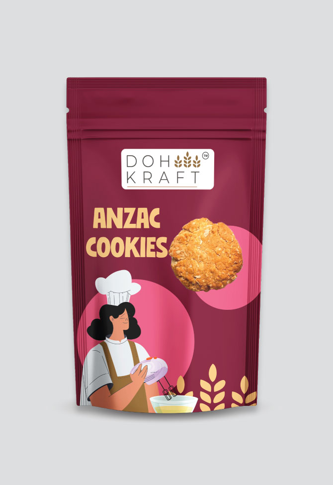
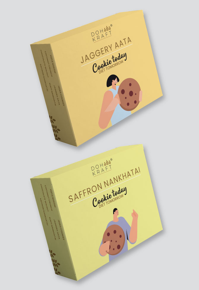
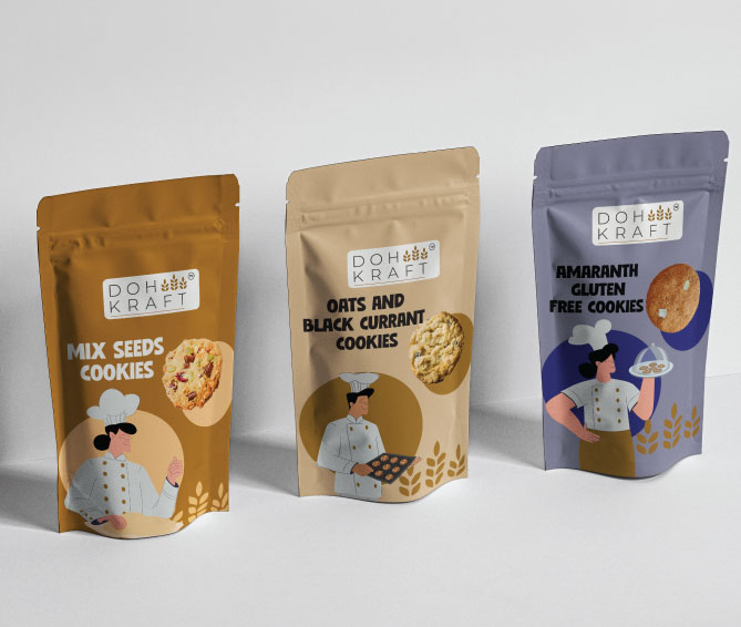
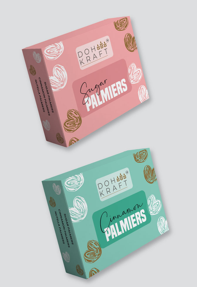
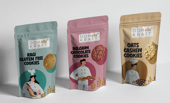
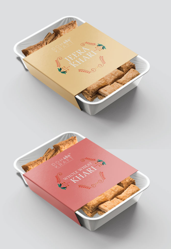
Muted palettes, clean layouts, and subtle textures brought their brand essence alive—earning us rave feedback and, more importantly, packaging that customers loved as much as the bakes inside. With Doh Kraft, we didn’t just brand a bakery. We designed an experience you could hold before you taste.